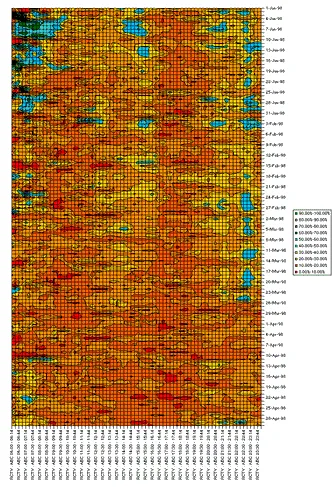
About eight years ago, I was analyzing television ratings at a leading network in Venezuela… when I came up with the following graph (see below). Rendering took forever in Excel, but the resulting image was not only beautiful, but highly informative. I basically took the network’s audience share for every 15-minute interval throughout the day, for every day of the year, and produced an area map, where interesting patterns became obvious.
The colors you see indicate the audience share for each point in time… deep reds indicate less than 10-percent share, blues around 40-percent and greens above 70-percent. This market is mostly a two horse race, which is why you see such high percentages. From these graphs it was easy to see patterns (like the orange swath down the right side of the image, or the blue-green lagoons at the top left and the blue river down the right edge) indicating areas where the network’s programming was strong or weak.
With more computing power, I’d have taken this one step further, adding a third dimension to the graph to indicate the difference in audience share with our main competitor. That would have made a cool landscape… Soon we could even have the Himalayas indicating dominance across a time slot, the cold ocean depths (and, why not, a little model of the Titanic) indicating hopeless programming. In between, maybe some palm trees and a Corona.
Data visualization is a powerful tool, and when done correctly it can bring new insights into otherwise stale data sets.
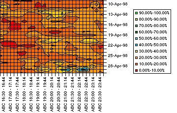
Here’s a detailed view of the graph, showing the chart for ABC (income-level demographics), from 4:30 p.m. to midnight, from April 9, 1998 until April 30th of that same year. On the right is the legend, explaining the different colors.
I found these on an old backup DVD along with the original Excel files and thought it’d be nice to share them. Let me know if you like them. My brain seems to be wired for pattern-recognition, so I tend to enjoy and appreciate these graphs a great deal.
If you like multi-dimensional graphics, I highly recommend the work of Edward Tufte. Check out his website and browse through any of his books next time you visit your local bookstore.
Technorati Tags: Patterns, Data Analysis, Television, Demographics, Visualization, Digital Media Strategy, Edward Tufte, Ratings, Multidimensional Graphs, Ratings
About the Author
Carlos Granier is a Tech Founder, CTO, and AI Strategist with 25 years of experience building at the intersection of technology and business. He co-founded Pongalo, one of the first US Hispanic OTT platforms, and built a YouTube MCN to 200M+ monthly views. He now helps founders and executives implement AI as practical infrastructure. Based in Miami, Florida.
Let's Connect
If you want to hire me or get in touch about something or just to say hi, reach out on social media or send me an email.
- X (Twitter) /
- Threads /
- Instagram /
- GitHub /
- LinkedIn / 📧